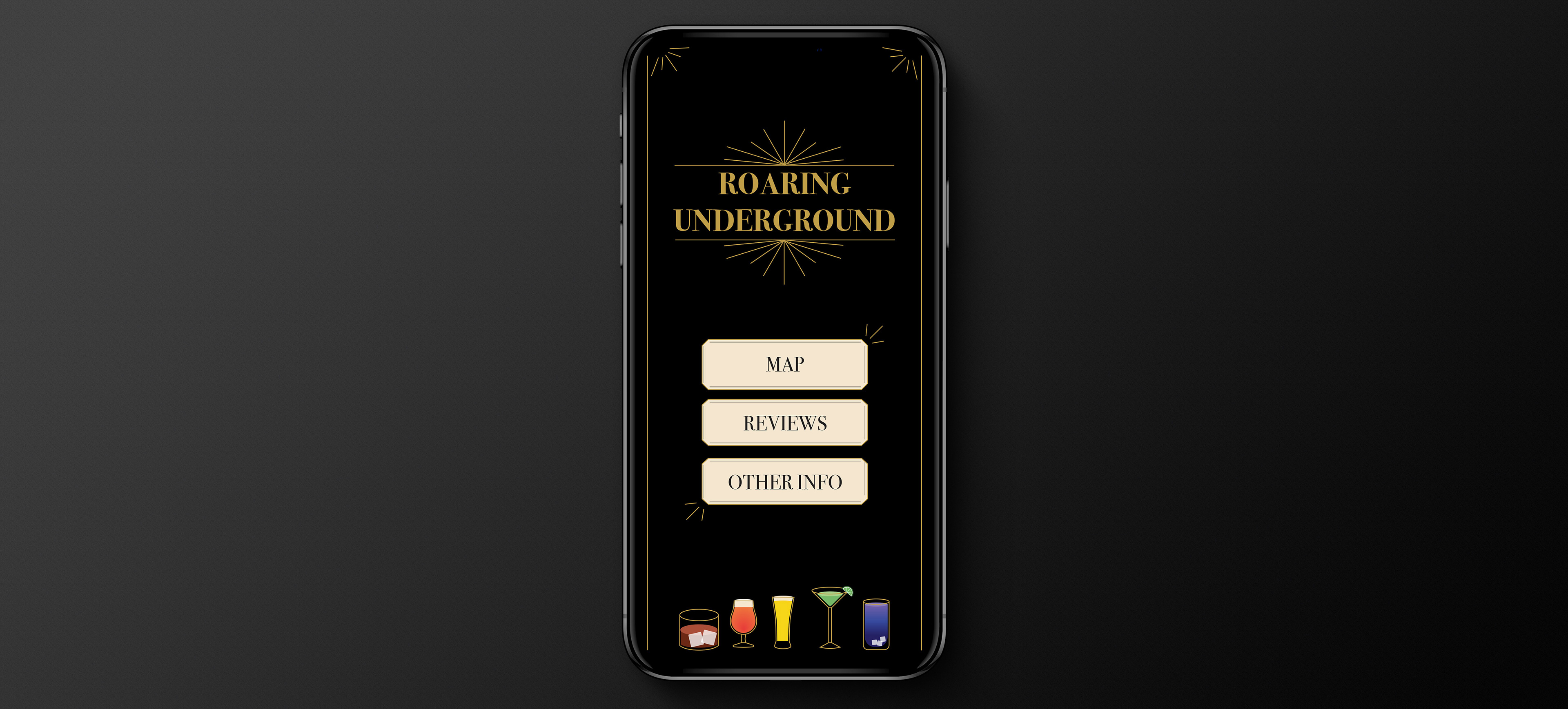
ROARING UNDERGROUND: GUIDE TO SPEAKEASIES
Role:
Graphic Designer
Graphic Designer
Focus:
UI/UX
UI/UX
Deliverables:
A mobile guide for speakeasies around San Diego
A mobile guide for speakeasies around San Diego
OVERVIEW
This project is to create a digital application of a map and guide for an interest of choice and others to use and explore user interfaces and design experience. With this in mind, I am designing a guide to speakeasies in the San Diego area for users who live in the area or are visiting San Diego.
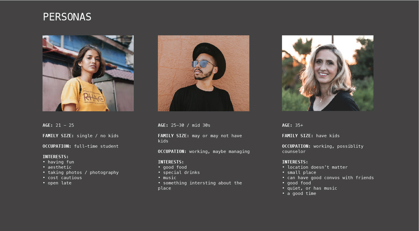
PERSONAS
Personas are an integral part of designing as they are the helping guide to designing the user interface and design experience. When researching speakeasies for my personas, I had noticed that there was a wide range of people from those in their early 20's to late 30's (and later) that went to speakeasies. With this research, I wanted to create an app design that was easy and simple to use for all ages.
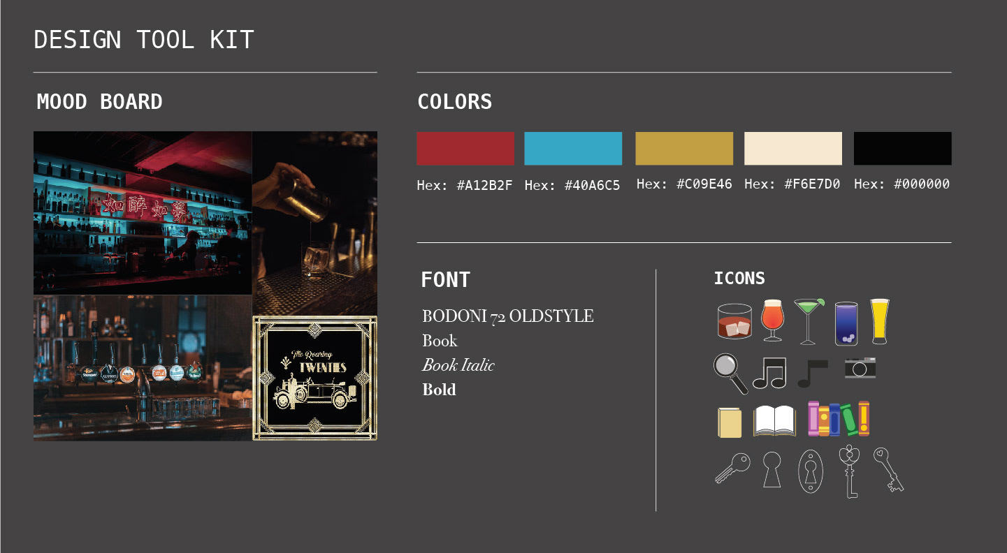
DESIGN TOOL KIT
PROCESS
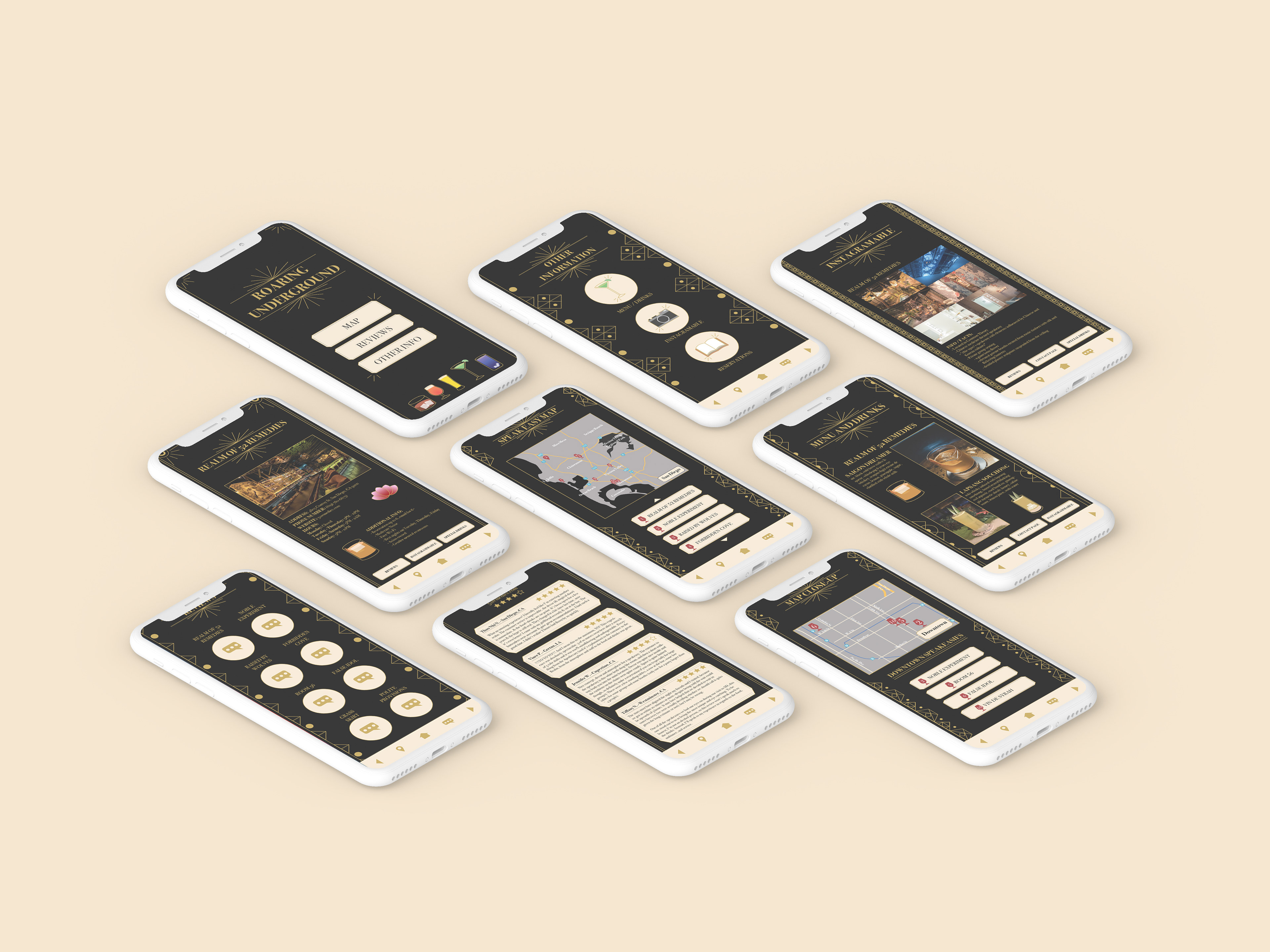
The app needed to include 3 sections: map, reviews, and other information of our choice. For the other information, I wanted to include information that everyone might find useful, which includes interesting facts about the speakeasy, if the speakeasy is good for pictures, what food and drinks they offer, and the ability to make reservations. When it came to designing the aesthetic of the app, I was influenced by the idea of the roaring 20's decor found on invitation cards since, typically, speakeasies have a dark, intimate, and cozy feel to them. This lended itself to the color palette mainly being a dark background with gold accents and other colors to highlight. Small illustrations and photographs can be found throughout the app to provide depth in the appearance of the application.
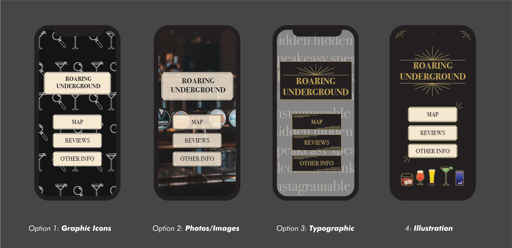
DESIGNING APP AESTHETIC
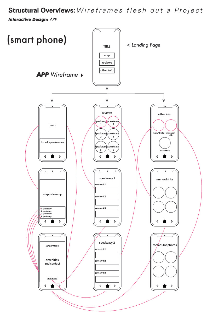
WIRE FRAME EXPLORATION
MOBILE PAGES EXPLORATION
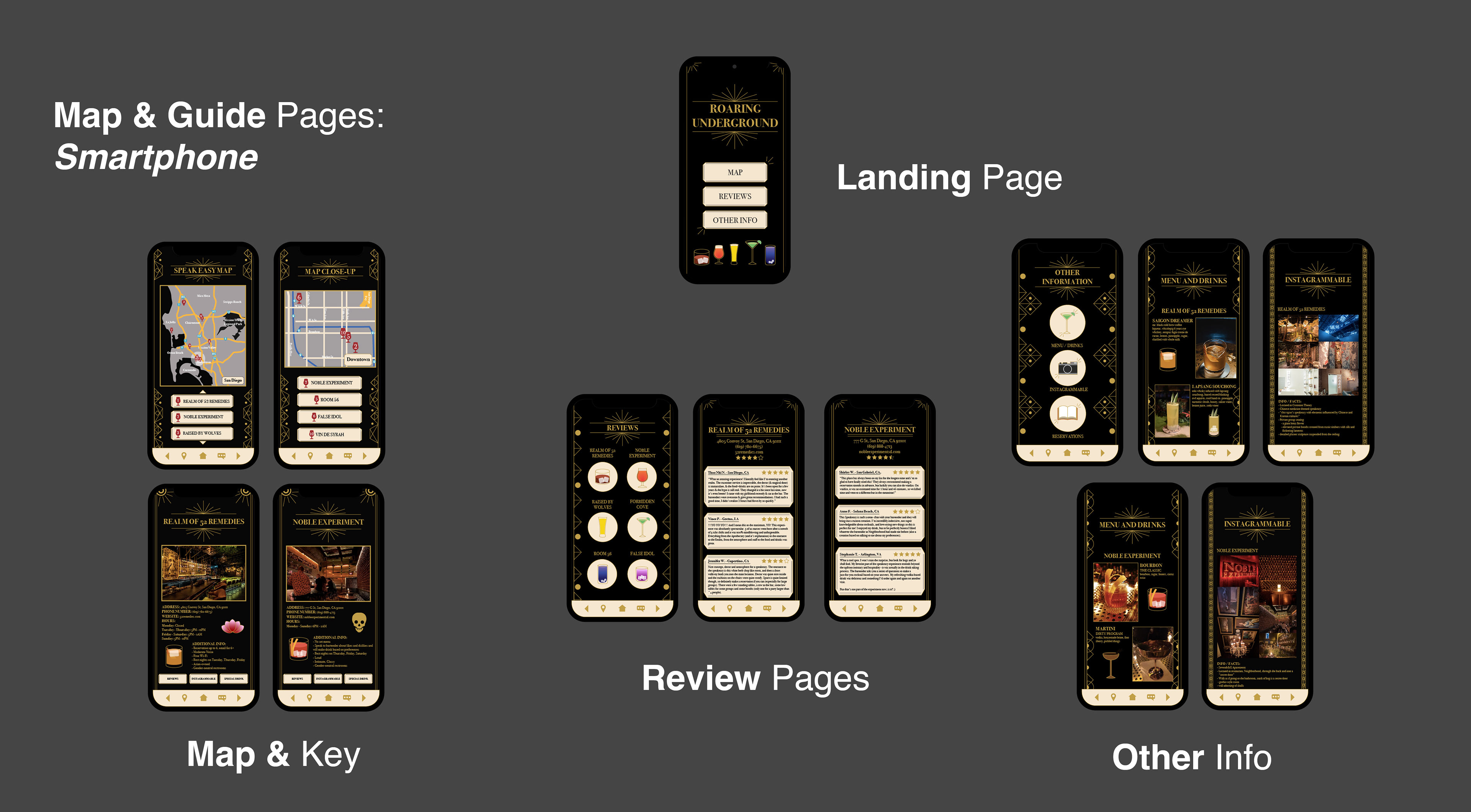
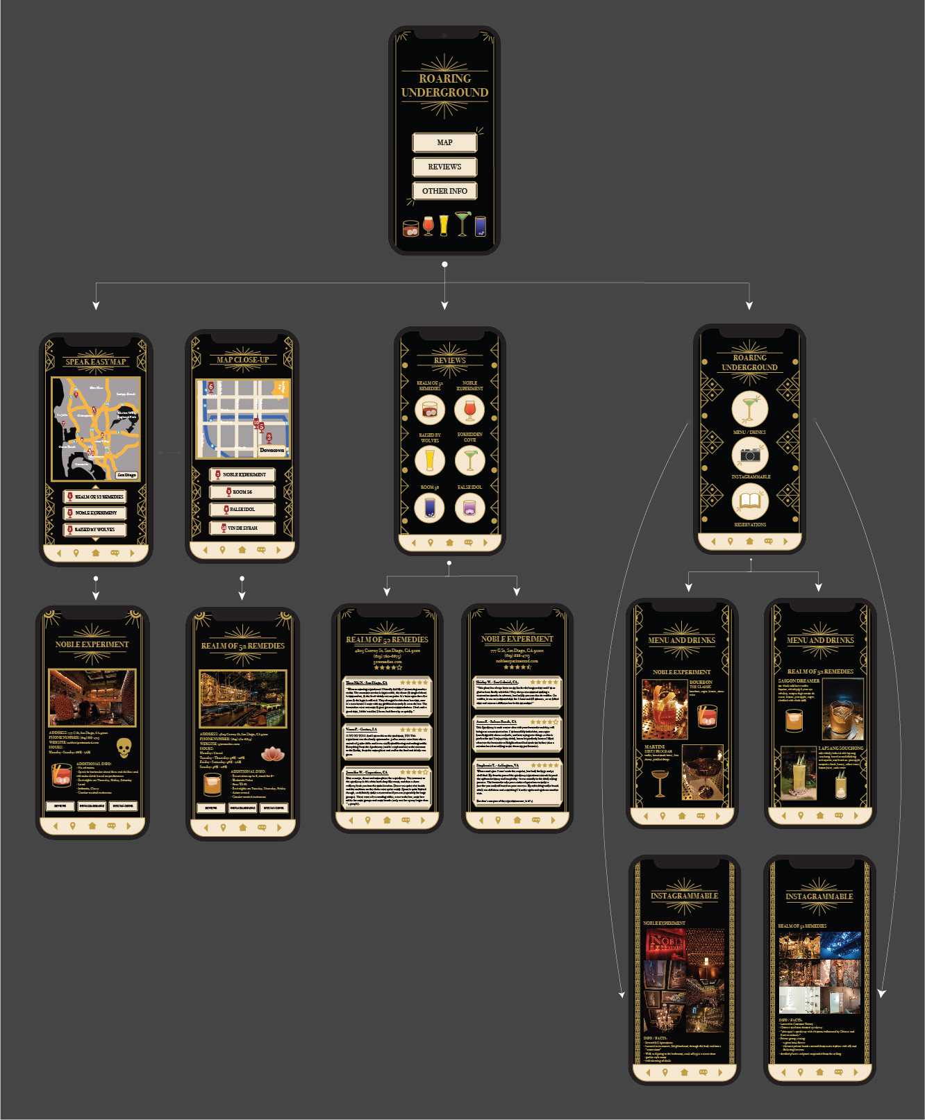
FINAL APP PROTOTYPE
MOCKUP APPLICATION